I originally joined the team to improve the sign-up process for gaining access to the 14-day free trial of the ServiceBridge app. Almost every visitor that signed up for the trial required a follow-up phone call with the sales team. The salesperson had to demo the product and migrate customer data. Without a phone call, our customers just weren't able to arrive at that magical moment of "first value." However, the demo would take close to an hour, which was not scalable. A self-onboarding experience was needed.

Before defining the pain points, I had to document the current process. How long does it take for someone to go through the demo? What are the typical questions people ask during or after the demo? What is it like to go through the experience?

The next thing was to document all the pain points. For this, I laid out all the screens to determine where users got confused. This also provided a holistic overview and helped to indicate inconsistencies in the micro-copy and UI.

Expectations for digital products are very high thanks to consumer apps that have trained people to expect to be up and running quickly. But this wasn't a sign-up flow for a scooter, it is a tool that requires your office location, currency, time-zone, a customer, syncing with QuickBooks, and many more things that every user needs to define before seeing the value of the app.

After identifying the friction points, the next step was to create a seamless and quick sign-up process. The goal here was to get someone past all of the forms and into the product with minimal thought and effort. We wanted to save all of that thinking power for the onboarding.

As a result, all but two optional fields were eliminated. Those we left were absolutely necessary. To alleviate future effort, we pre-filled as much information as possible. For example, we asked for the user’s office address and reused that information by pre-filling routing features. Our system requires a team for scheduling work, so we automatically created teams named after the person signing up.

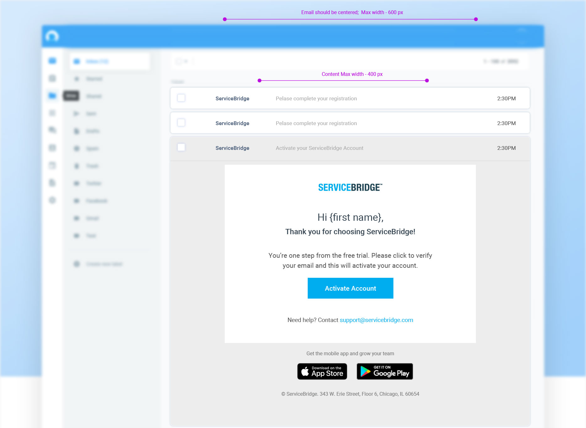
We also needed users to download the mobile app to capture the full value of the product. To promote those downloads, we included the link in the activation email.

Every successful sign-up led a potential customer inside of the product. To get the most from the onboarding experience, we explored three options to engage users with their first experience.
Option 1: the welcome takeover.

Option 2: "zero states" with calls to action to get started.

Option 3: Onboarding checklist

During this project, I was also working with Pendo, which is a tool we use to manage onboarding guides and tooltips. Pendo also provides analytics for funnels. I tagged all the sign-up pages to see where visitors were dropping off. This helped us create a success measurement metric.